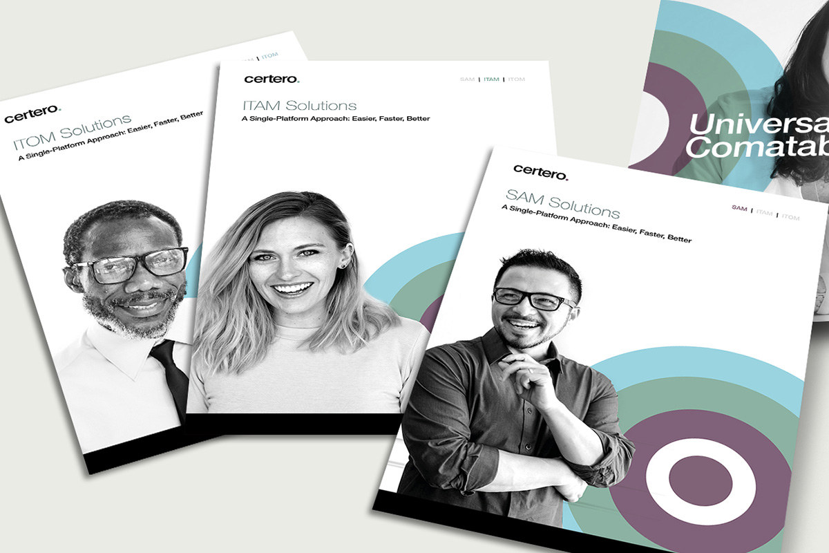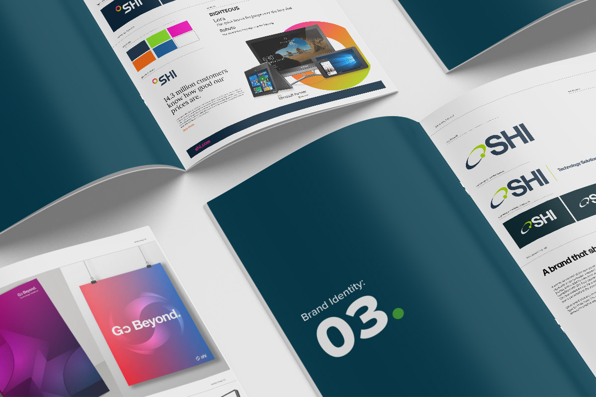
Refreshing a SAM brand to feel as human as the team behind it.
Following acquisition by The Carlyle Group, Livingstone Technologies wanted to broaden its blue-chip relationships and update how the business was perceived.

Move the perception from technology-first to a more complete people-and-service proposition.
The existing corporate colours had recognition, so the new mark evolved rather than abandoned them.
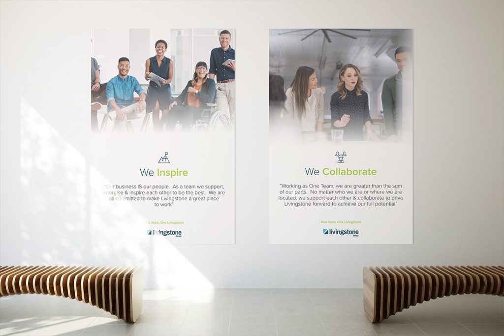
The bigger change came through typography, messaging and imagery designed to reflect the expertise and personality of the people delivering the service.
Modernise the marque without losing the recognisable palette.
Form introduced a cleaner, more dynamic logo and updated typography.
The revised identity was then supported by imagery and messaging designed to put people back into the technology story.
A closer look at the project.
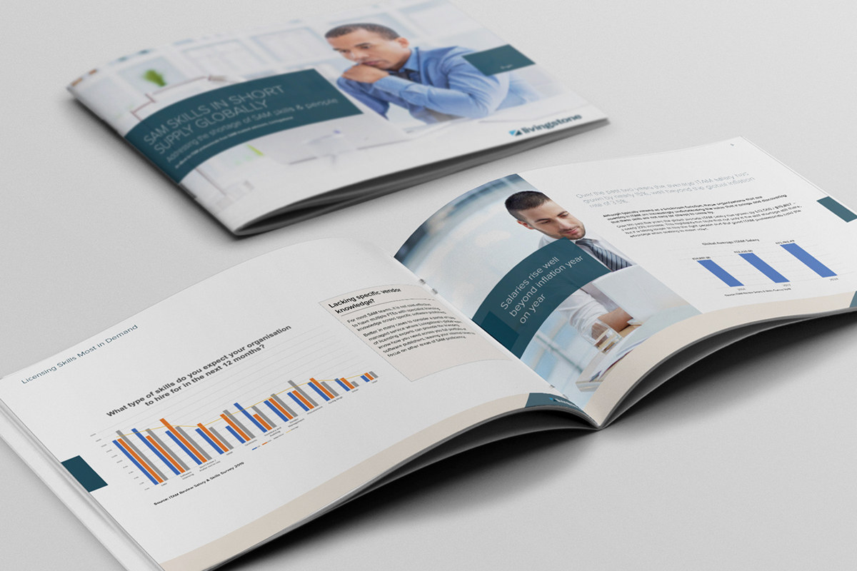

Show that there is no single model for the perfect SAM manager.
A new awareness campaign created a highly visual digital presence and was extended into exhibition stands.
The idea supported the broader repositioning away from a purely technology-focused view of the company.

Roll the new identity out in practical phases.
The first phase updated the existing website with the new visual style, navigation changes and revised service positioning.
The phased approach allowed Livingstone to improve the digital presence without waiting for a complete platform rebuild.
A more human, modern brand for a company selling expertise as much as technology.
Livingstone gained a clearer visual and verbal position across campaign, collateral and web while preserving useful recognition from the existing identity.