Putting people and personality back into a software asset-management brand.
Certero recognised that its identity had drifted over time. Form was asked to re-establish consistency and change the way customers saw a technology-led SAM business.
Fix the drift, then make the brand feel less like anonymous enterprise technology.
The client openly acknowledged that years of inconsistent application had weakened the brand.
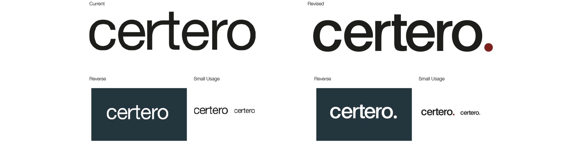
Form began by redefining the logo and colour system, then used messaging and imagery to reconnect the technology proposition with the people and service behind it.
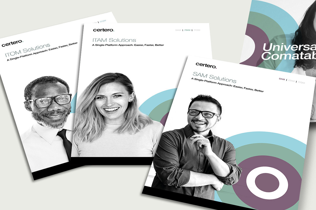
Create a contemporary system from logo, muted colour and a recognisable brand graphic.
A softer, modern palette was combined with a refreshed mark and visual assets built around the dot from the logo.
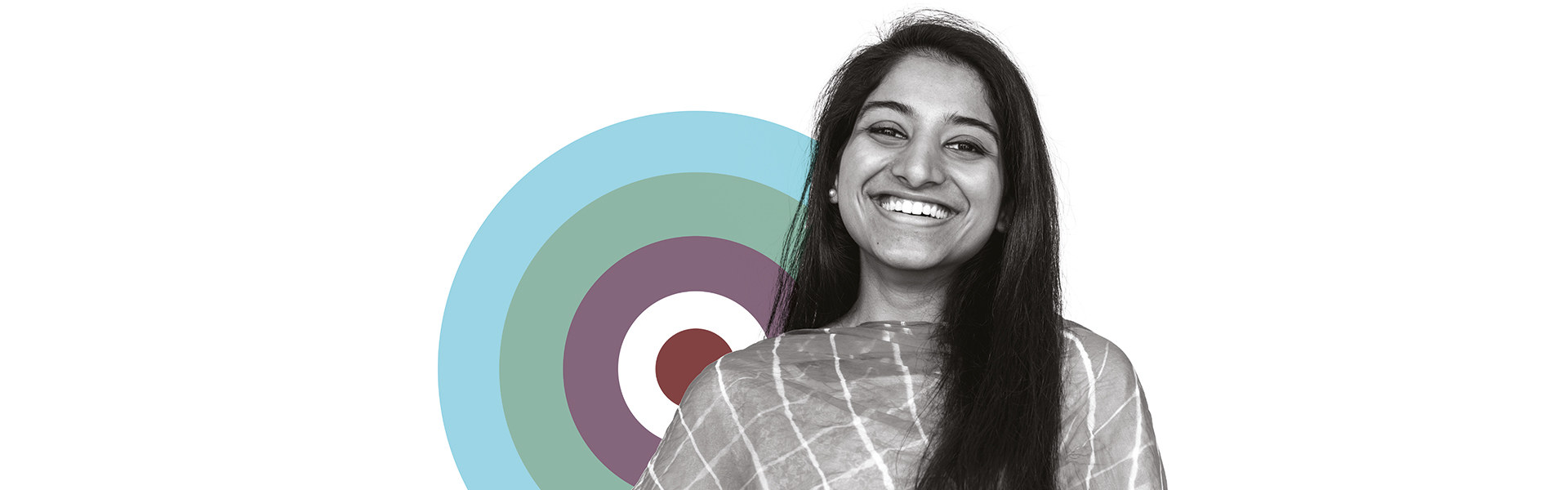
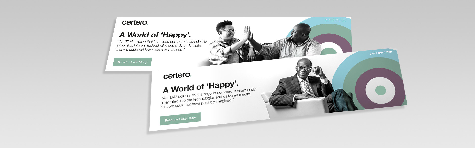
The resulting target-like device became a flexible element across brand communication.
A closer look at the project.
Make customer satisfaction the central message.
Customer feedback consistently highlighted service quality, so the campaign language was built around that experience rather than generic SAM features.
Joyful, diverse imagery helped move the identity away from faceless technology.
Give the internal team a system they could maintain.
Form supplied website graphics, social advertising and brand guidelines after sign-off.
The aim was to prevent the same visual drift from returning once the launch work was complete.
A more human software brand with clear rules for keeping it coherent.
Certero moved from an inconsistent legacy identity to a brand system built around customer experience, people and recognisable visual assets.