Taking a mid-flight rebrand and building it into a working global system.
Ibexa’s internal team had already created a new name, logo, palette and typography. Form was brought in to develop, expand and complete the visual language across the wider business.
Turn strong foundations into a complete identity that could survive real marketing use.
Unlike a conventional rebrand, the core ingredients already existed. The task was to decide how those elements should actually behave across print, digital and sales material.
The client wanted a decisive break from the rigid visual conventions of legacy B2B technology.
Introduce a recognisable illustration system rather than generic corporate photography.
Custom illustrations helped humanise technical DXP propositions, flex across formats and establish a proprietary visual language.
Form worked with internal teams to define how those elements should combine with the new logo, colour and typography.
A closer look at the project.

Give global sales and marketing teams practical tools.
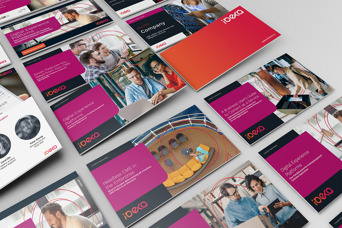
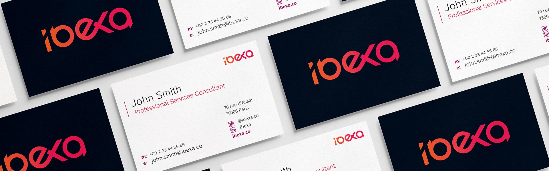
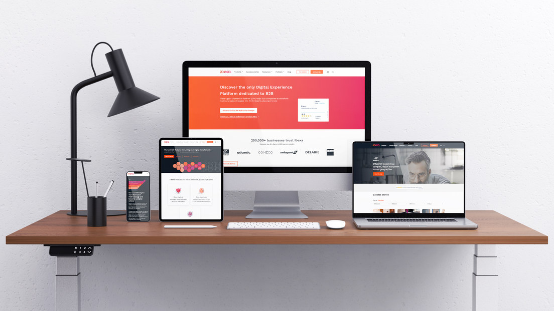
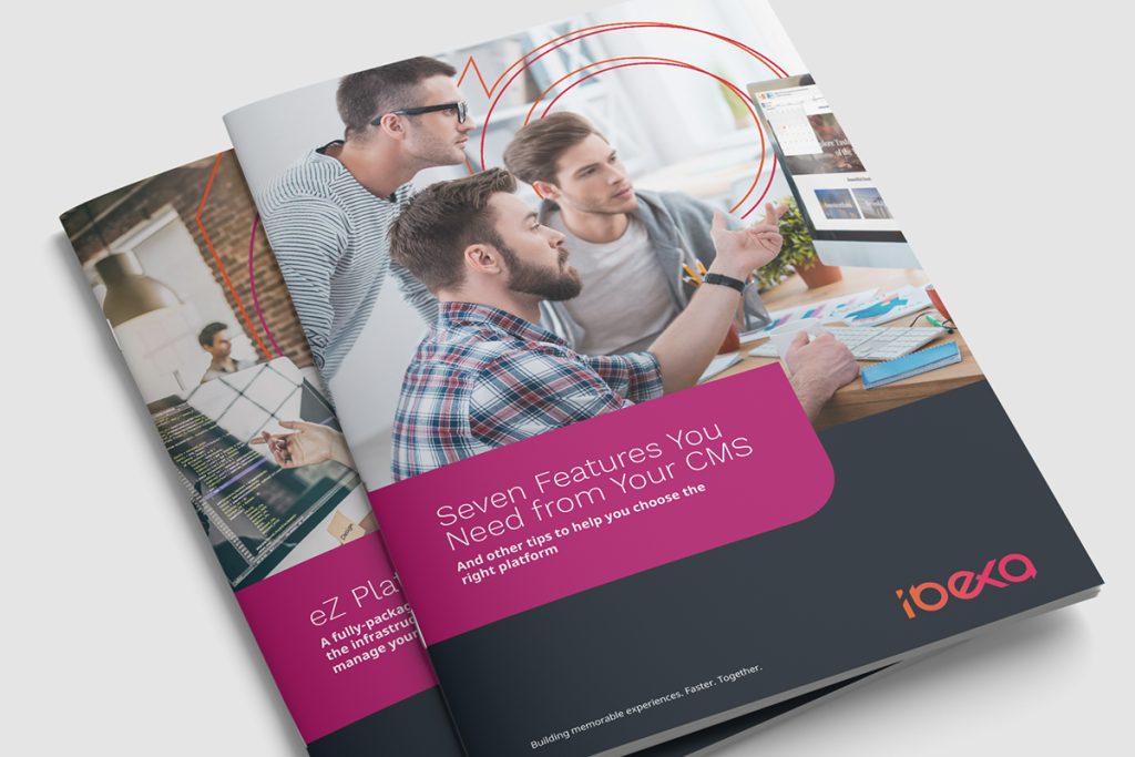
The rollout included stationery, PowerPoint and pitch templates, eBooks, white papers, digital advertising and email.
A modular toolkit gave internal teams more freedom to create new output without losing the rules of the new identity.
Use the new identity to create visible separation from the old business.
Following board sign-off, the rebrand moved into full production and launch.
The resulting system gave Ibexa a much more vibrant and recognisable presence in the B2B digital-platform market.
A partially built rebrand turned into a complete working identity for global marketing teams.
Form extended the internal foundations into an illustration-led brand system, asset toolkit and campaign language that could scale across the business.