Rebranding a QA giant with more personality and play.
Testronic invited Form to pitch for a complete rebrand across gaming and entertainment QA. The identity needed to be professional enough for major studios while still feeling at home in the culture of games.
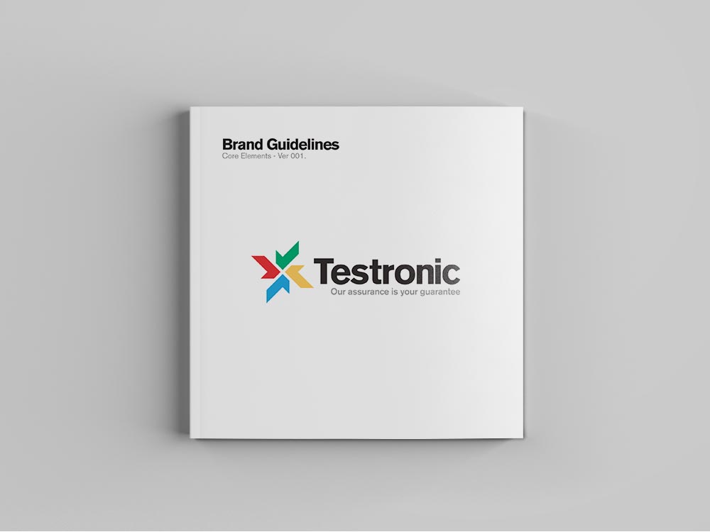
Create a serious global QA brand that is still allowed to have fun.
Form already understood gaming culture from work with publishers, which helped move quickly into the visual problem rather than learning the category from scratch.
The key task was creating a bold identity capable of representing four service lines while giving each one a recognisable place inside the system.
Use one mark to organise four service areas.
The new icon was built from a fan of ticks, with colour used to identify different divisions across gaming, TV, entertainment and software.
A strong, clean wordmark completed the system and created the foundation for the wider visual identity.
A closer look at the project.
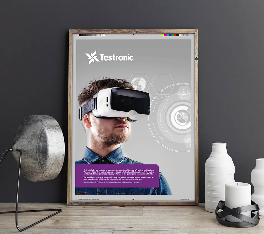
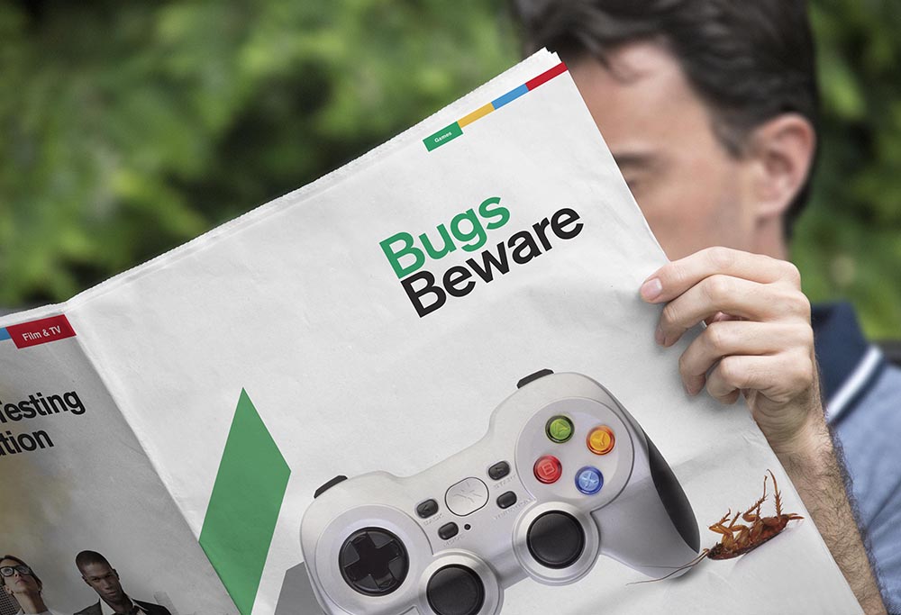
Coordinate every touchpoint rather than drip-feed the rebrand.
Testronic chose a full launch, requiring website, event stands, campaigns, brochures and other material to be ready together.
That made planning and close collaboration with the internal team as important as the design itself.
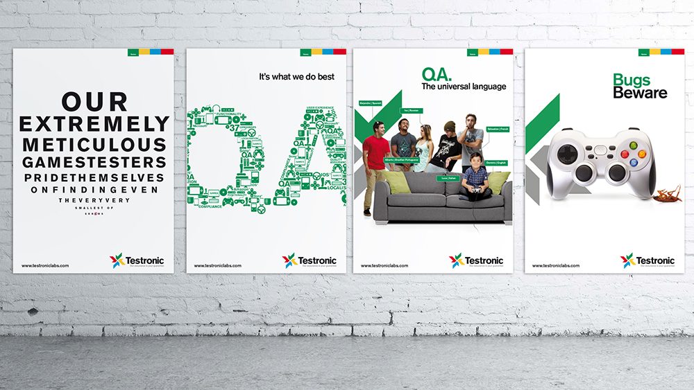
Use the category language to make the campaign memorable.
The “Bugs Beware” campaign used dead bugs and gaming controllers to make the QA proposition instantly recognisable.
The tone gave Form more room to create memorable advertising than a conventional corporate campaign.
A brand that helped Testronic look like the leader it was becoming in gaming QA.
The new identity and campaign language rolled across the organisation and supported Testronic’s expansion across Europe and the US.