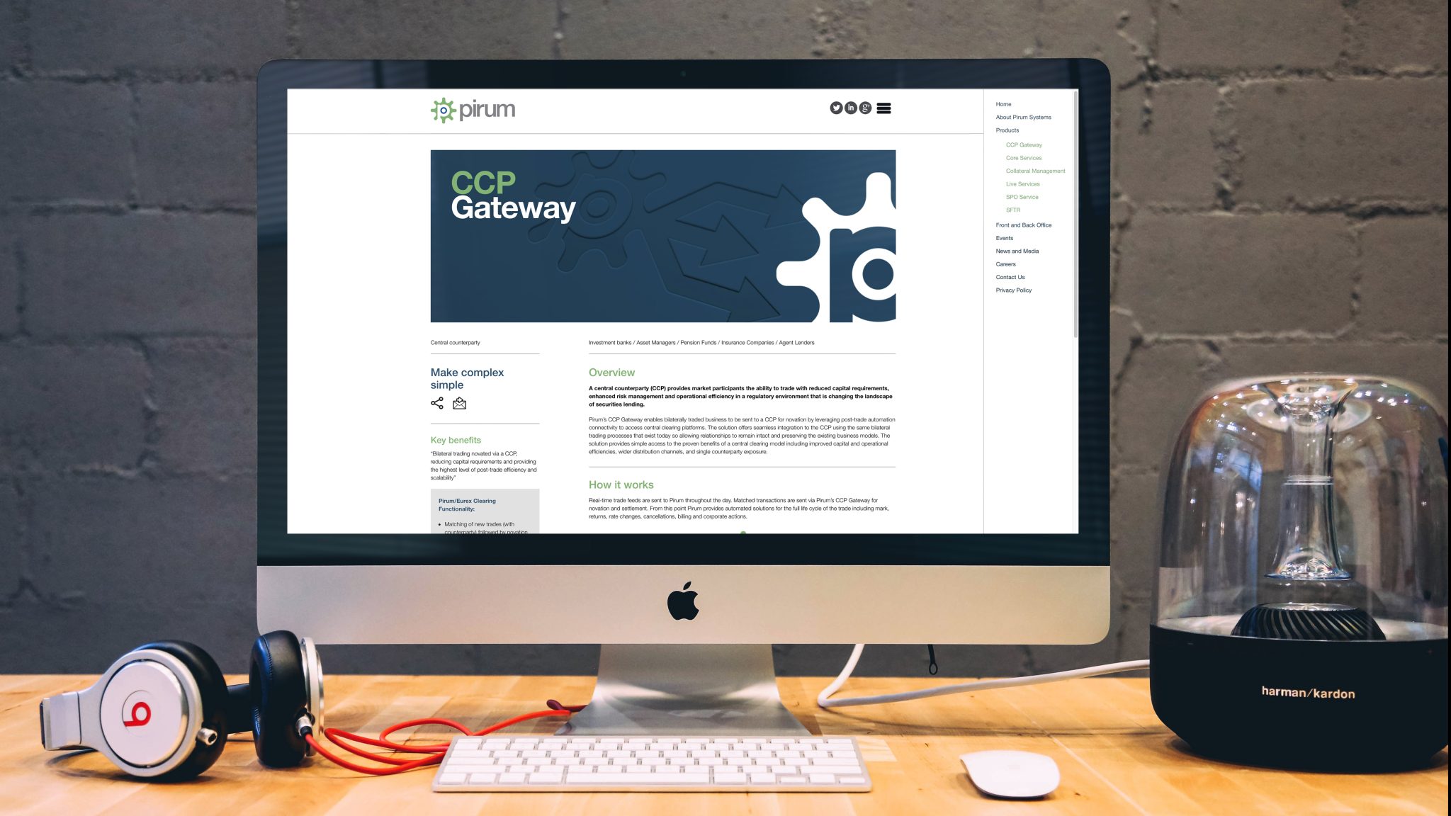
Evolving a fintech brand from start-up to market leader.
Pirum had moved well beyond its start-up phase in securities-finance automation. The identity needed to reflect market leadership, trust and technical innovation while preserving useful continuity.

Make the brand look like the company Pirum had become.
The project needed to reposition Pirum as a mature innovator trusted by major financial institutions.
Form retained the existing primary colour connection while redesigning the core mark, typography, tone and wider visual system.
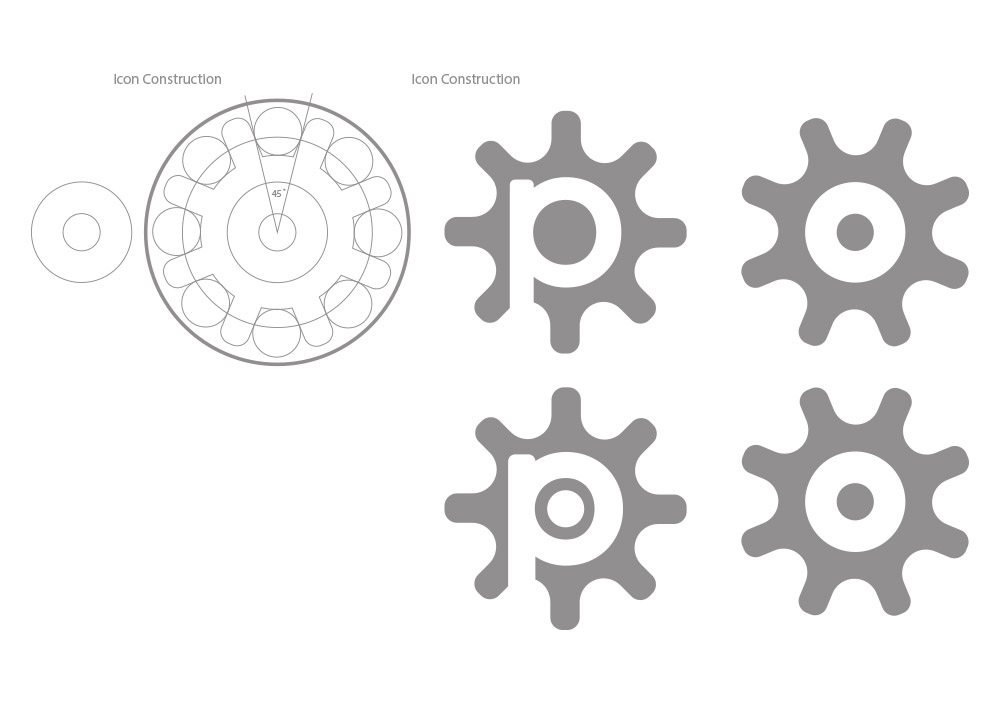
Use a moving cog as a metaphor for the connected parts of the business.
The new mark uses a cog-like device with a negative P, creating a recognisable symbol linked to automation and continuous operation.
Modern typography and updated tone-of-voice rules reinforced transparency, trust and partnership.
A closer look at the project.
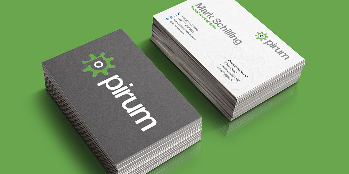

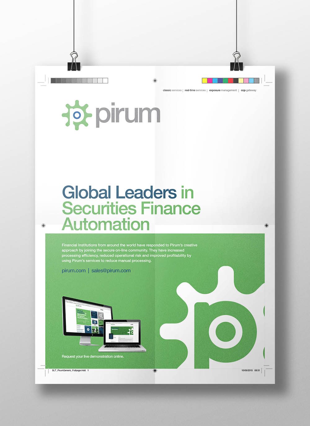
Roll the identity out as a complete business system.
The rebrand launched alongside a new website, updated marketing materials, office branding, internal documents and global print/digital advertising.
Brand guidelines helped Pirum maintain consistency after the main rollout.
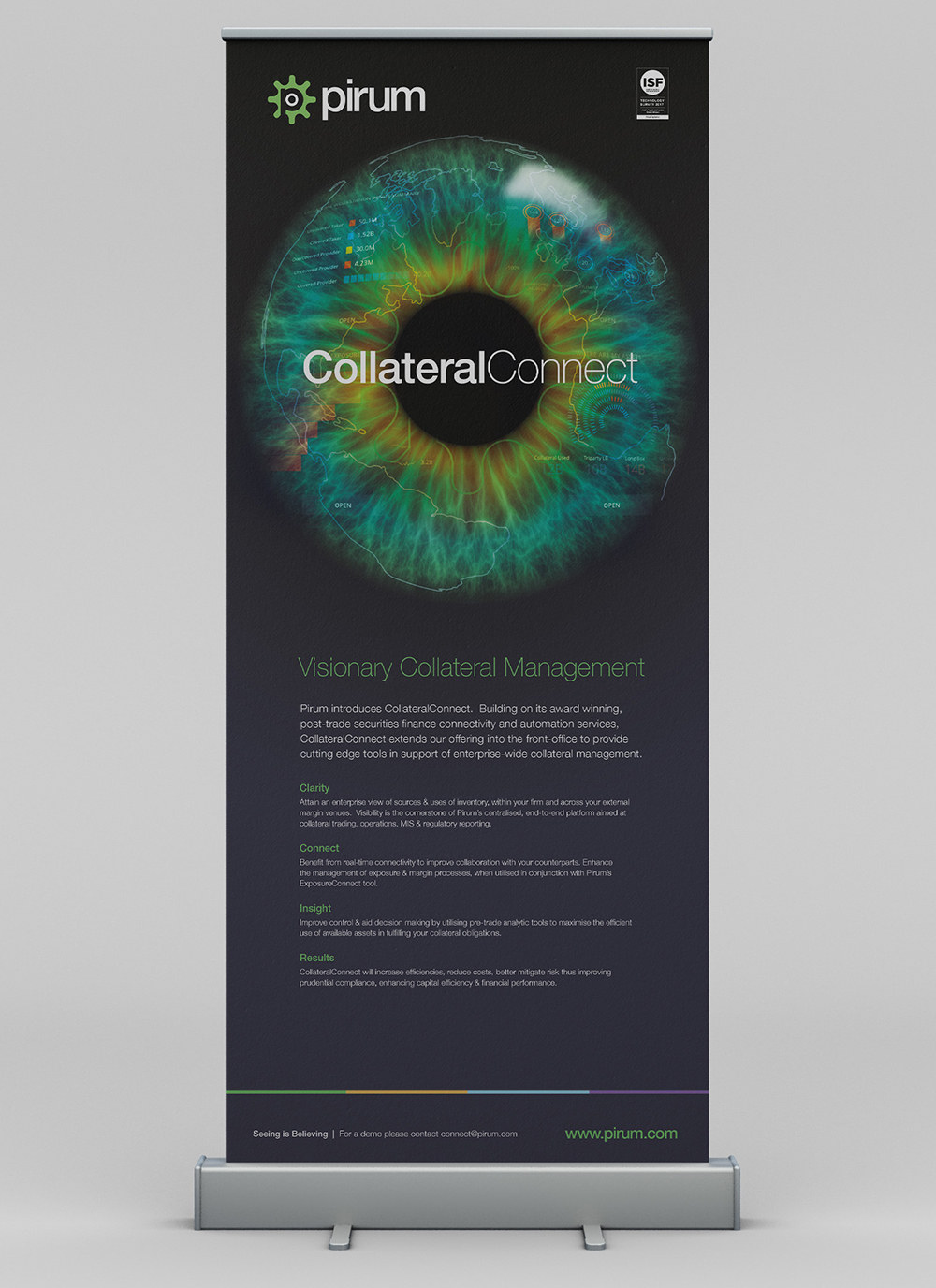
A more mature identity for a fintech company operating at global institutional scale.
The new brand increased recognition and became closely associated with Pirum’s position in securities-finance automation.