Giving financial AI the confidence of an enterprise brand.
Gentek’s founders had deep experience in regulatory reporting technology. The brand needed to reflect that authority while positioning the business as a forward-looking leader in AI-driven enterprise solutions.

Make advanced financial technology feel precise, credible and human.
The audience included senior decision-makers who needed to see experience and control, not start-up theatre.
At the same time, Gentek needed a visual language that could communicate AI and regulatory complexity without becoming cold or inaccessible.
Build precision and progress into the mark itself.
Multiple rounds of logo development led to a geometric identity centred on purpose, progress, precision and control.
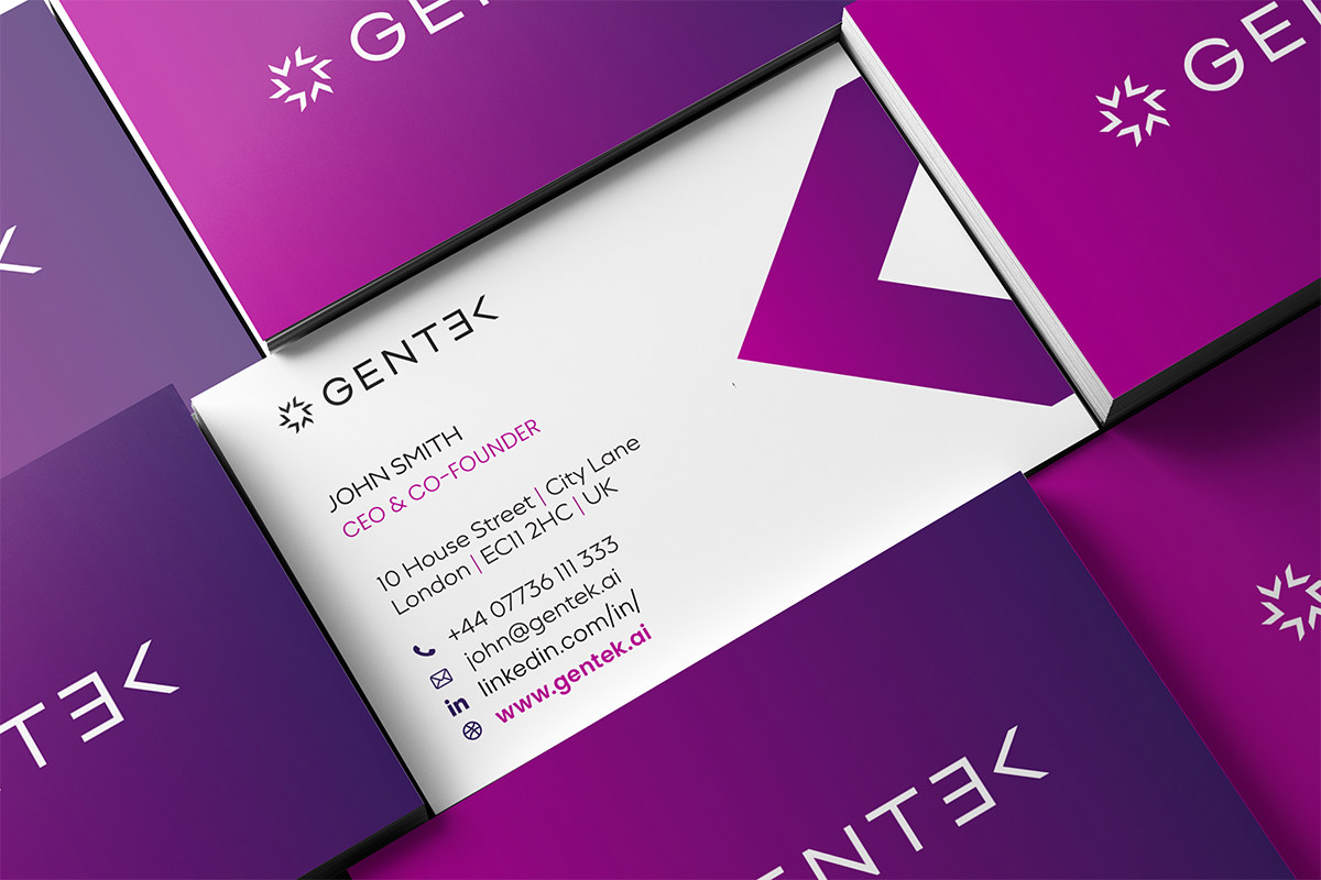
Typography, spacing, gradients and tone were developed as one system, with the distinctive K device becoming a recurring graphic asset.
A closer look at the project.
Give the brand enough range for sales, events and thought leadership.
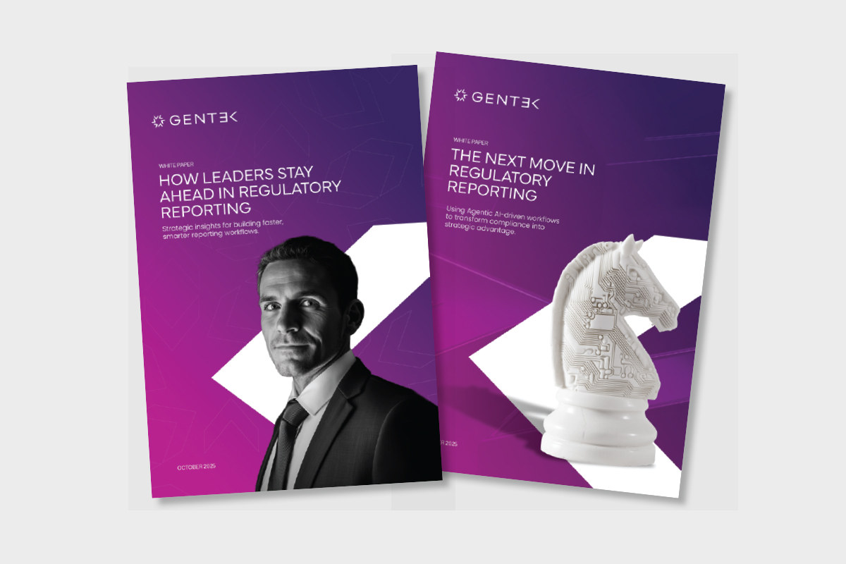
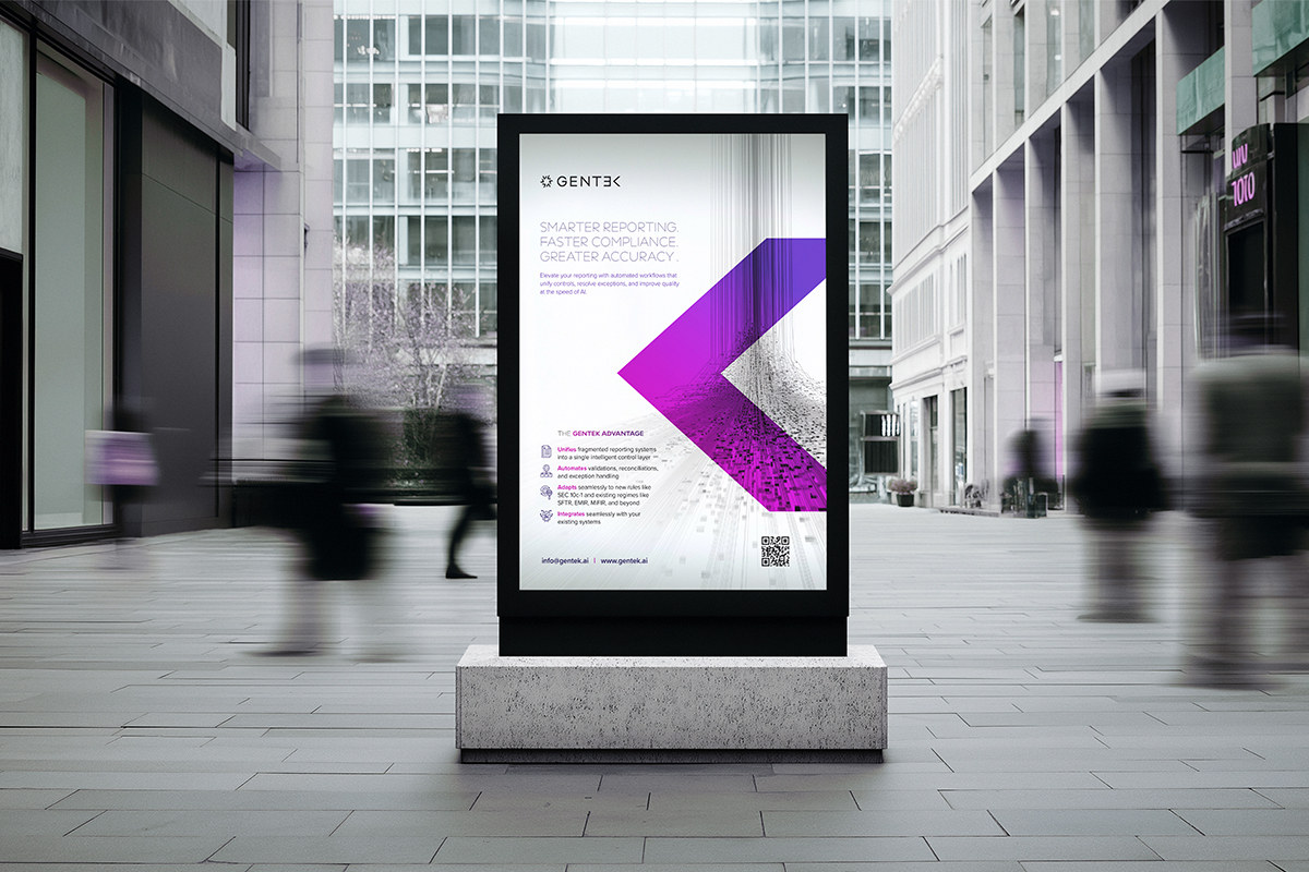
The identity was applied across investor decks, product brochures, event campaigns, white papers and concertina handouts.
Advertising and social work focused on the transformation from regulatory complexity to clarity and control, while brand guidelines captured the rules for future use.
Carry the identity into the digital platform.
With the core brand rolling out across print and digital channels, the next stage moved into the design and build of Gentek’s website.
The aim was to make the same clarity and assurance visible in the online product story.
A financial AI brand with enough authority for enterprise buyers and enough flexibility to keep growing.
Gentek now has a unified identity and verbal system that can carry complex propositions consistently across sales, marketing, events and digital channels.