Refreshing an established FX brand without throwing away recognition.
Form had created the original Central Markets and Central FX brands. Years later, with the trading arm sold and the focus returning to foreign exchange, Central FX came back for a modern reboot.
Update the brand enough to feel new without pretending it had no history.
The existing Central FX identity had recognition in the market, so a complete replacement would have discarded useful equity.
The aim became a controlled evolution: modernise the logo, expand the visual language and create stronger campaign assets around the renewed FX focus.
Make subtle changes that create more room for the wider brand.
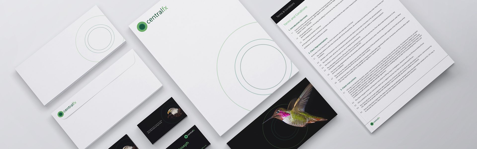
The logo was refined rather than replaced, giving the existing mark a more contemporary edge and creating new graphic components for wider use.
That allowed the brand to move forward without disconnecting from its established customer base.
A closer look at the project.



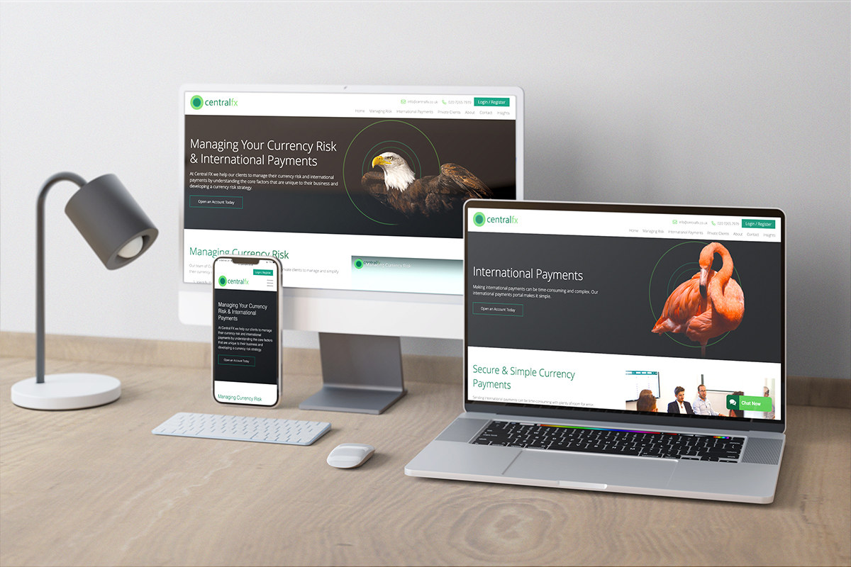
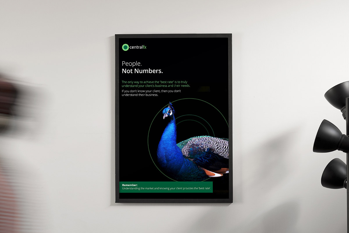
Use recognisable bird imagery to express the product qualities.
Stylised photography connected different birds with attributes such as knowledge, security and speed, while circular forms derived from the logo tied the system together.
The imagery gave the brand a clear narrative device for website and marketing communication.
Create a related product identity with a more fintech character.
The Hedgemaster currency-risk platform required its own identity, connected to Central FX but with a more technology-led feel.
A related mark, heavier typography and bespoke hawk imagery were used to communicate control and continual monitoring.
A recognisable FX brand with a cleaner identity and more useful visual storytelling.
The refresh gave Central FX a consistent system across website and collateral while preserving the familiarity of the established business.