Creating a trading education brand with confidence and personality.
Your Online Trader needed a brand that could feel vibrant and approachable while still carrying the authority expected from a financial trading specialist.
Make trading education feel accessible without losing financial credibility.
The target audience needed both aspiration and reassurance, so the identity could not feel overly institutional or overly playful.
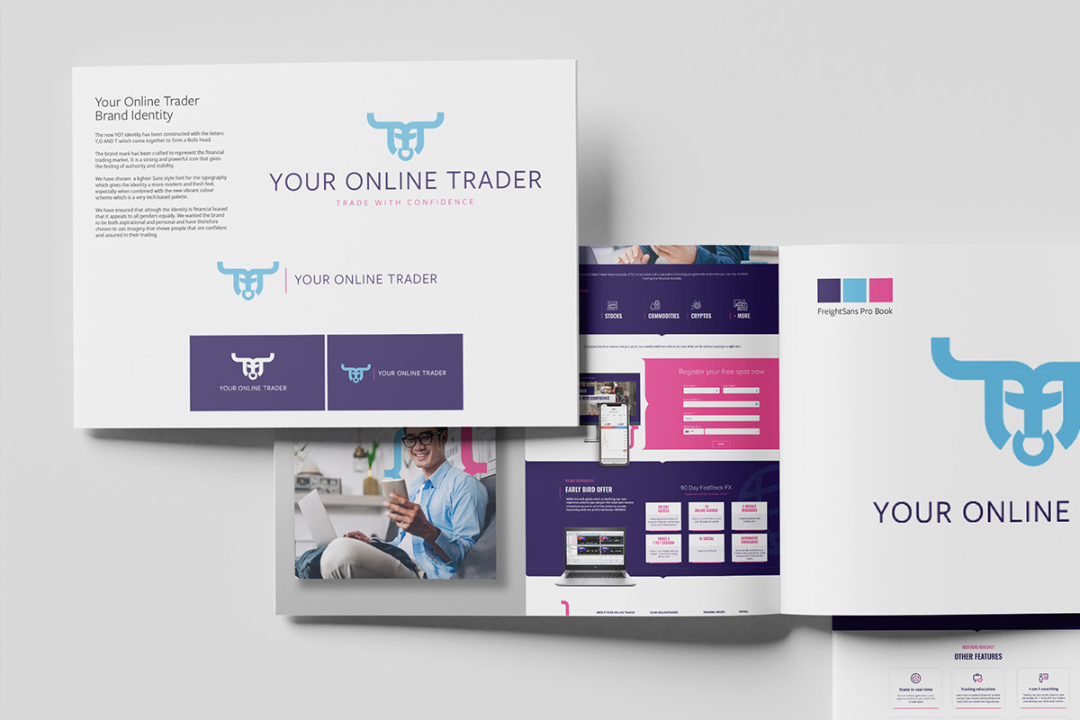
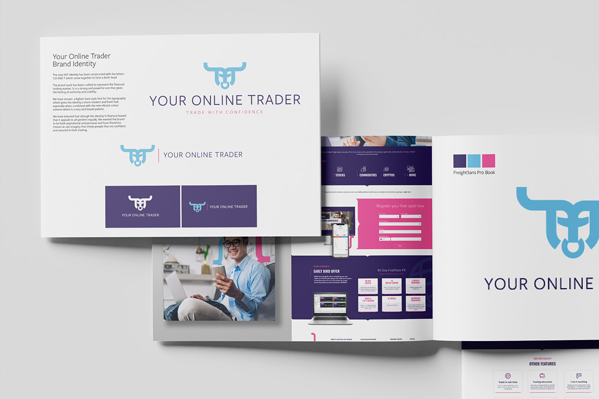
Form used the abbreviated YOT name as a starting point for a geometric mark with a direct visual reference to trading.
Turn three letters into an ownable trading symbol.
The YOT acronym was developed into a unified graphic element incorporating a bull’s-head reference.
A lighter typographic style and brighter blue, pink and purple palette broadened the brand’s appeal while retaining a clear financial undertone.
A closer look at the project.



Use the colour system to create a more welcoming online experience.
The website paired the vibrant identity with confident, approachable people imagery and a clear presentation of the education proposition.
The aim was to make the financial subject feel aspirational rather than intimidating.
Carry the same personality into the ongoing customer experience.
The identity extends into trading updates, animated social campaigns, course material and webinars.
That consistent application keeps the brand visible long after the original launch.
A trading brand with enough authority for finance and enough personality for education.
Your Online Trader gained a flexible identity and digital system capable of supporting both customer acquisition and ongoing learning content.