Breaking the visual conventions of Forex and crypto.
Cerus Markets wanted to look like an innovative trading company offering something genuinely different, not another broker using the same stock imagery, colours and category clichés.
Create a trading brand that felt credible without looking interchangeable.
Cerus Markets combined traditional trading with an unusual product proposition: the ability to trade crypto against traditional stocks.
That gave Form a clear positioning opportunity. The identity needed to communicate innovation while remaining professional enough for customers placing trust and capital with the business.

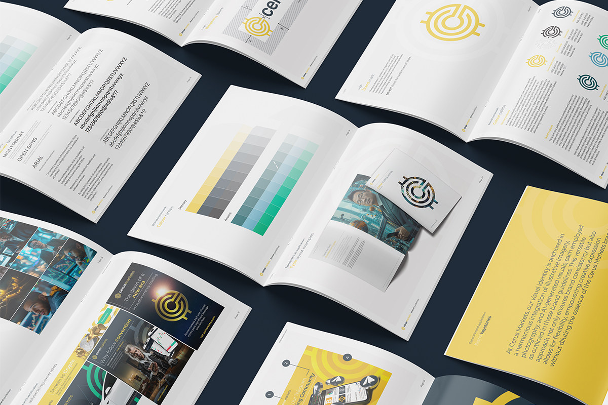
Build the difference into the logo, palette and brand system.
The design process developed messaging, tone, logo concepts, complementary colour palettes and typography together rather than treating them as separate tasks.
A subtle reference to cryptocurrency was worked into the logo, while muted base tones and brighter accents moved the brand away from the standard trading palette.
The work in motion.
Use AI to avoid the same stock photography as every other broker.
Form created a bespoke set of AI-generated human images so the website and campaigns could use imagery unique to Cerus rather than familiar trading-library photography.
Those visuals then carried through the website, marketing campaigns and exhibition material to give the whole launch a more recognisable character.

Turn the finished identity into a complete digital experience.
Once the messaging, logo and brand system were signed off, Form designed and developed a responsive Cerus Markets website for desktop and mobile.
The launch package was completed with the smaller day-to-day assets needed by the marketing team so the identity could continue without drifting.
A financial brand that could belong to the category without looking like the category.
The result was a coherent brand, imagery system and website with enough individuality to distinguish Cerus in a crowded Forex and crypto market.