Creating a trading brand designed for India and wider Asia.
Vida Markets started with a company name and a regional ambition. Unlike the other INFINOX-related brands Form had worked on, Vida needed to stand completely on its own.
Build trust in the first market without trapping the brand there.
The primary launch market was India, where the category can often feel visually closer to gambling than professional brokerage.
Vida needed to look dependable enough for customers making significant financial decisions, while keeping enough flexibility to expand across wider Asian markets.
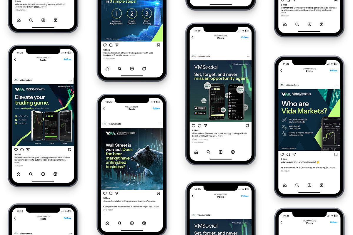
Use colour to break a category habit.
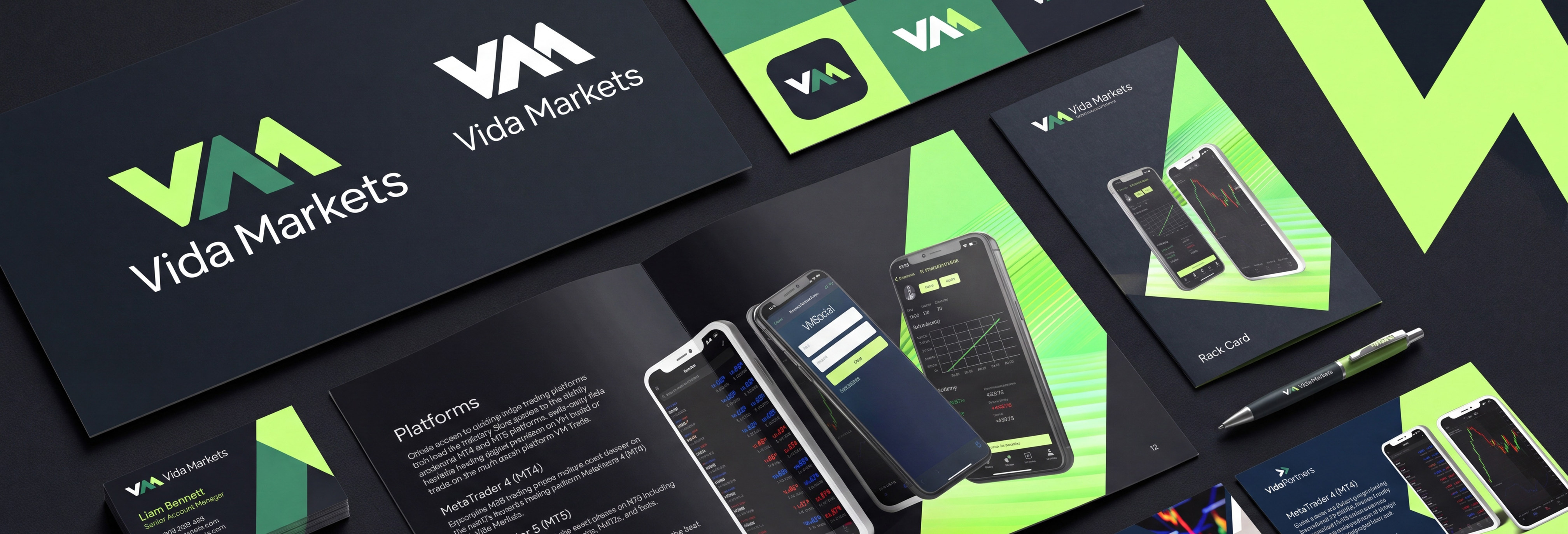
Form deliberately moved away from the red, blue and black combinations common in trading and introduced a highly visible lime-green influence.
A family of related logos was then created for Vida Markets, Vida Partners and Vida Social, giving each division its own identity inside a coherent parent system.
A closer look at the project.
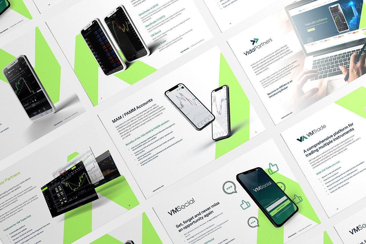
Move from logo into a complete launch system.
Visuals and messaging were developed around the brand’s technical credibility and regional audience, with digital journeys and marketing assets designed for launch.
The “Trade with Confidence” campaign used lighthouse imagery in a technology-led style to communicate security and guidance.
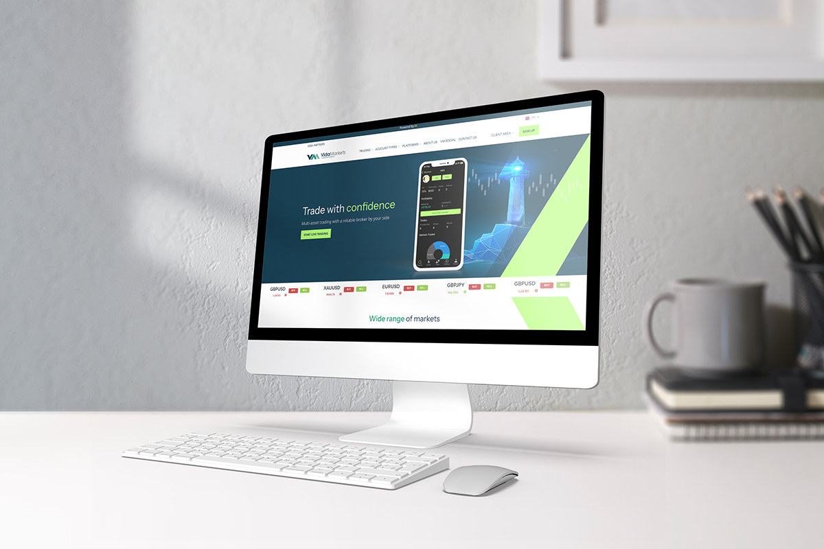
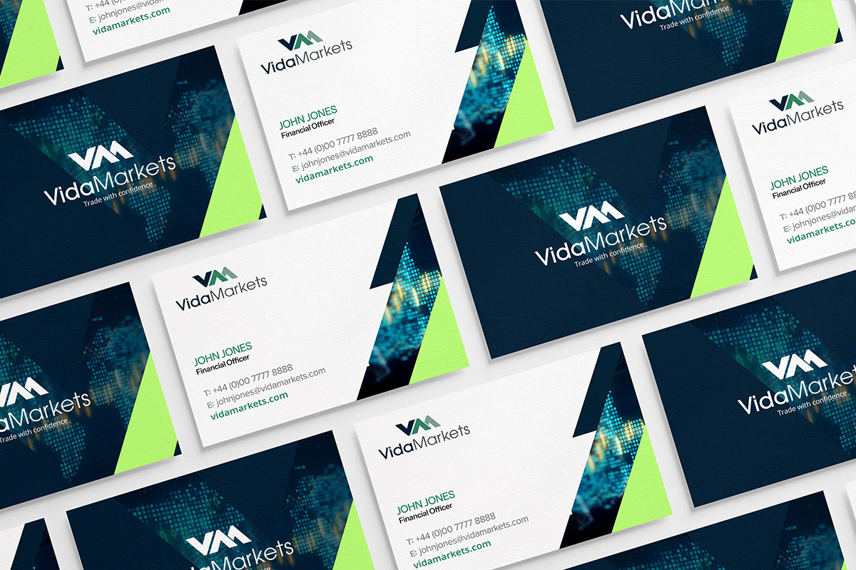
Create enough assets for partners and local marketing teams to use the brand properly.
The wider programme included divisional websites, marketing materials, educational resources, social content and campaign assets.
Form continues to support the marketing team as Vida expands recognition across the region.
A professional trading identity that feels at home in its launch market without looking region-limited.
Vida launched with a complete brand and marketing system built for India first, but designed to travel across wider Asian markets.
This project has a deeper Case Study.
The Work page shows what we made and the thinking behind it. The Case Study goes further into the challenge, delivery and measurable outcome.
View the case study for Vida Markets