Modernising a packaging brand without losing family heritage.
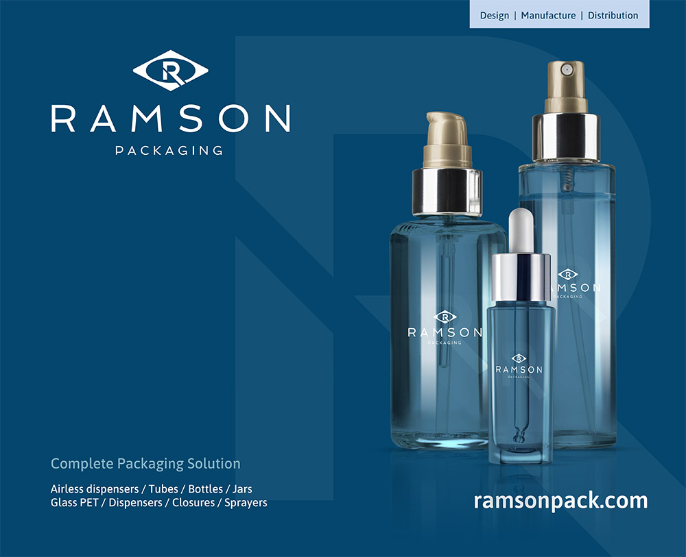
Ramson Packaging had more than 25 years of history, including a marque originally created by the current CEO’s grandfather. The rebrand needed to modernise without erasing that connection.

Give a Scandinavian packaging business a cleaner identity while protecting the visual equity in the original mark.
Ramson’s audience sits heavily within cosmetics and beauty, where branding tends to be light, minimal and highly refined.
Form therefore developed a more contemporary direction using muted, pastel colour choices and careful typography rather than an aggressive redesign.
Use the old marque as a bridge between generations of the business.
Logo options retained a clear relationship with the historic identity while giving the overall brand a more modern presentation.
Typography and imagery were developed to suit the clean visual expectations of beauty and cosmetics packaging.
A closer look at the project.

Make the system practical for internal teams to continue using.
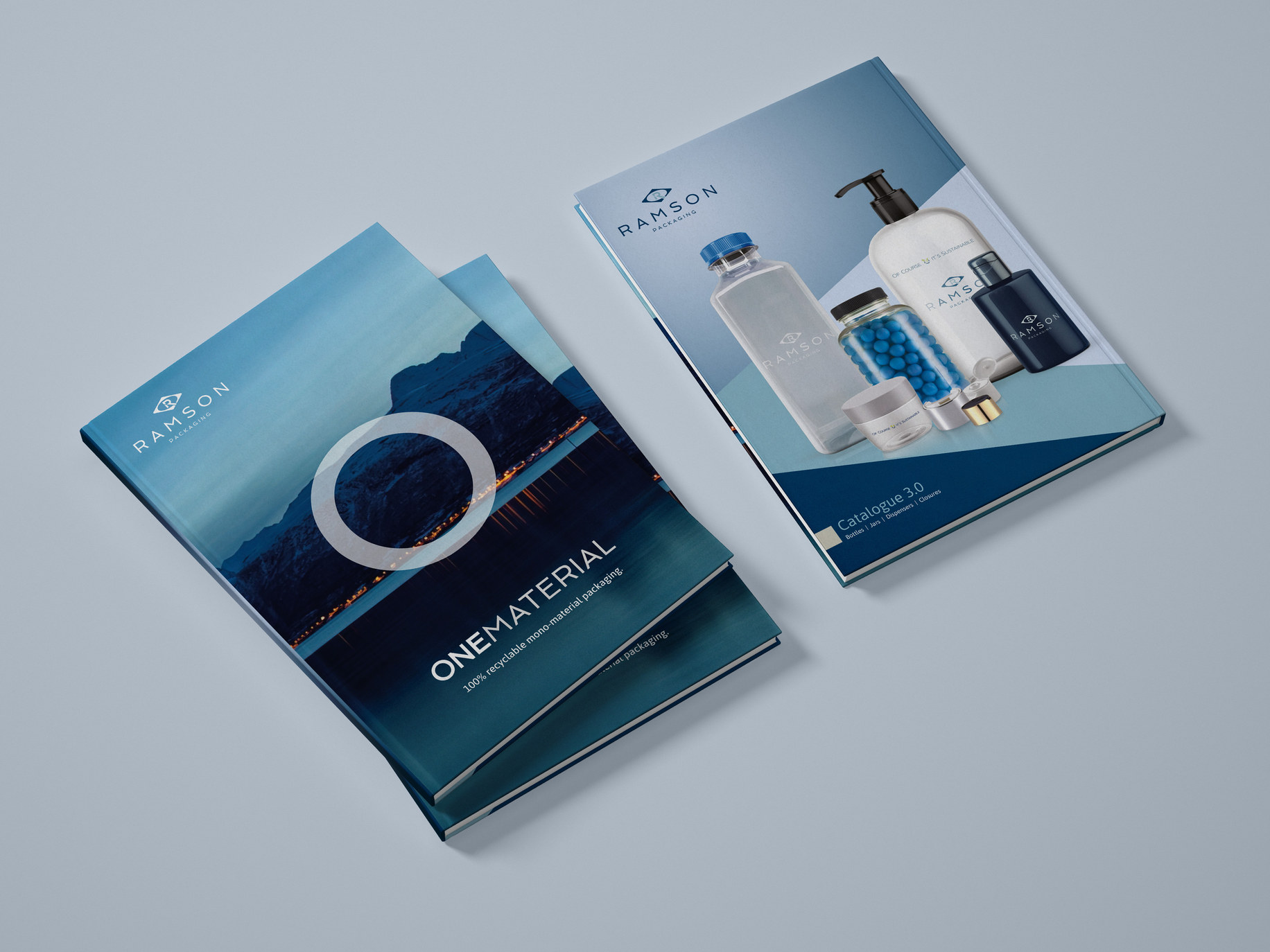
Form created brand guidelines, catalogues and exhibition material before handing the assets to Ramson’s internal marketers.
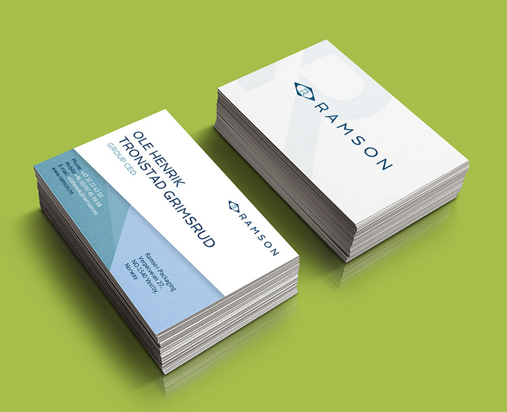
The identity was designed to work consistently across web and print rather than become an agency-only system.
A brand refresh that feels current while keeping the family story visible.
The updated Ramson identity continues to be used across catalogues, exhibitions and customer communication.