Building a craft beer brand with Italian roots and global appeal.
Brew Factory began as a small family-run brewery near Milan and grew into a wider craft beer business. Form created an identity and campaign system designed to travel beyond the local market.
Keep the authenticity of craft beer while creating a brand that could work internationally.
The category offered enormous visual freedom, but that also meant the brand needed a simple enough core idea to remain memorable.
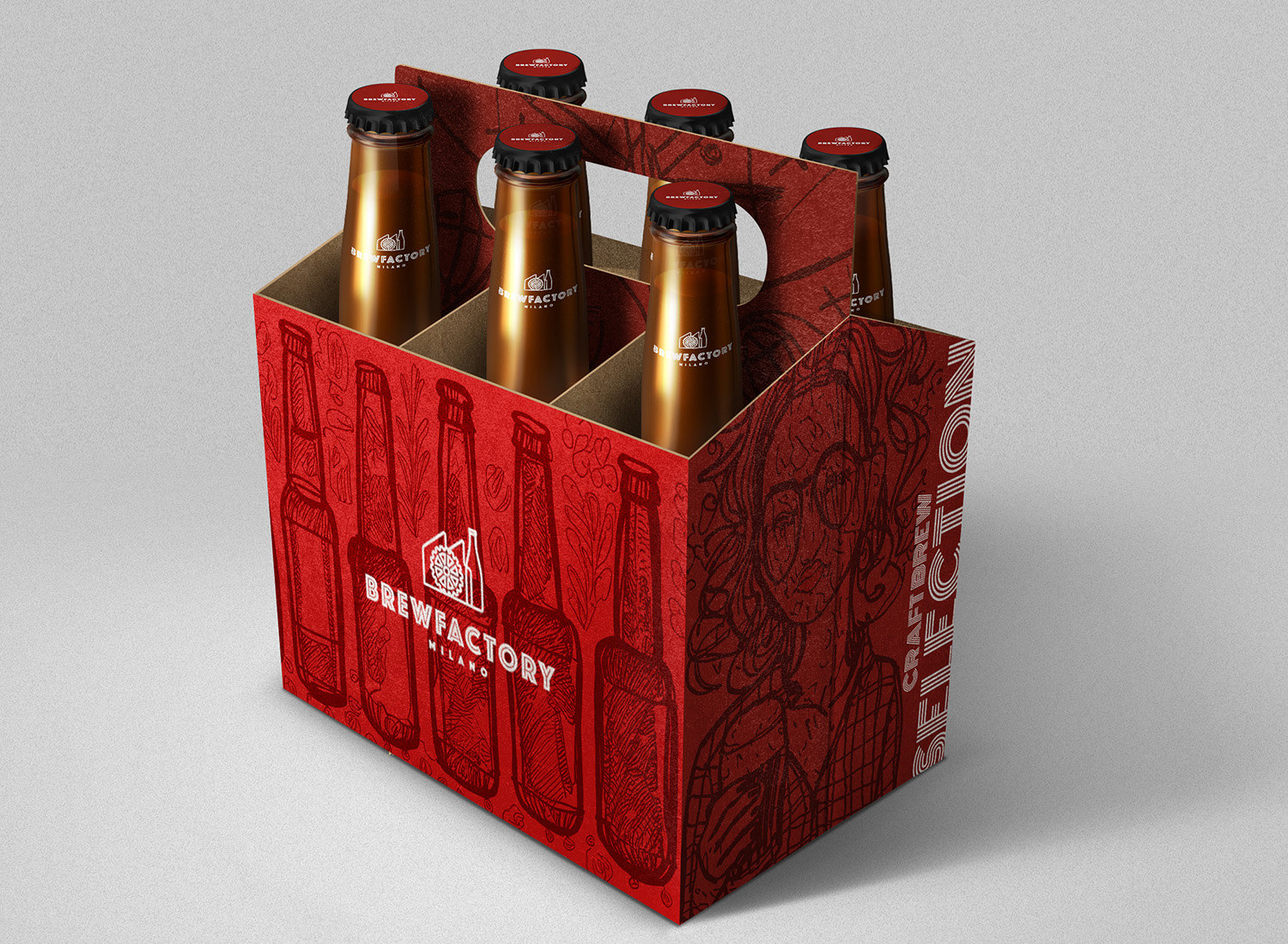
Form focused on an icon, type and packaging system capable of feeling both rustic and modern.
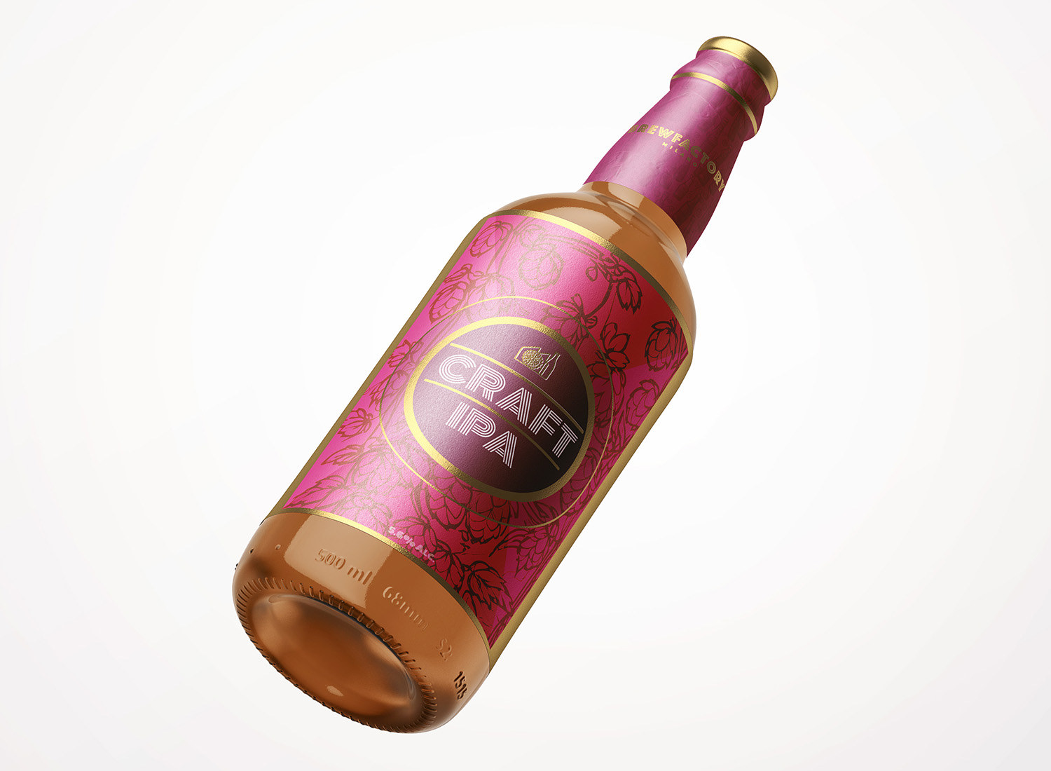
Create a simple icon and strong typography with enough personality for the bottle.
The mark was developed around the idea of the brewery itself, supported by typography that combined cleanliness with a more authentic craft feel.
On-pack presence mattered: the identity had to remain visible when surrounded by highly expressive competitor designs.
A closer look at the project.

Use Italian cultural cues without turning the brand into a stereotype.
Campaigns referenced globally recognisable Italian elements to reinforce provenance and give the launch more character.
Those campaign ideas extended the identity beyond packaging into a fuller brand world.
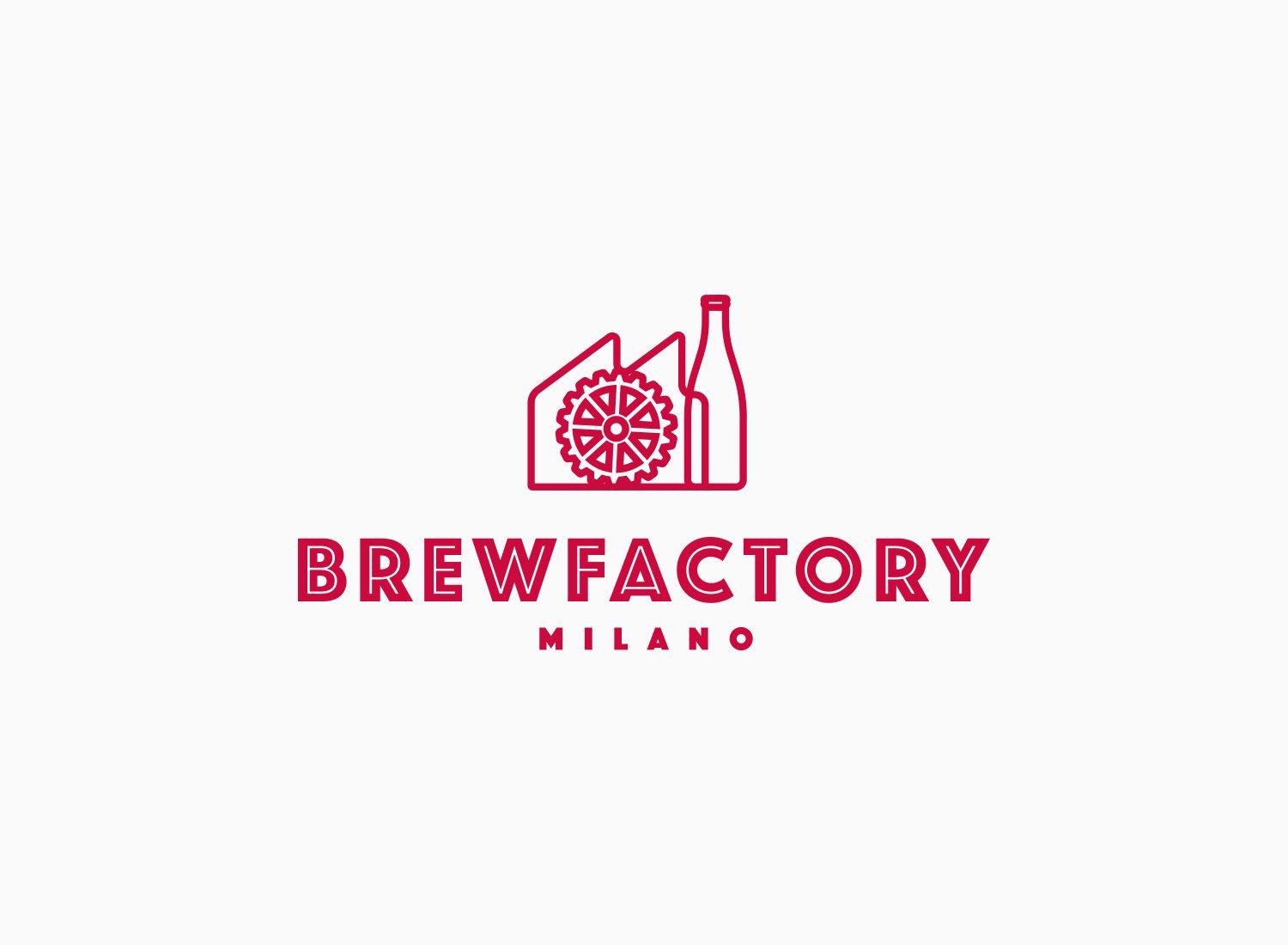
A craft identity that feels Italian without being limited to Italy.
Brew Factory launched with a recognisable packaging and campaign system designed to support growth into wider European and international markets.